Cruz Azul
I did my Undergraduate thesis for Cruz Azul, a reference in the supplementary health sector, one of the most well-equipped hospital medical complexes in the State of São Paulo, where the best concepts of modern medicine practice.
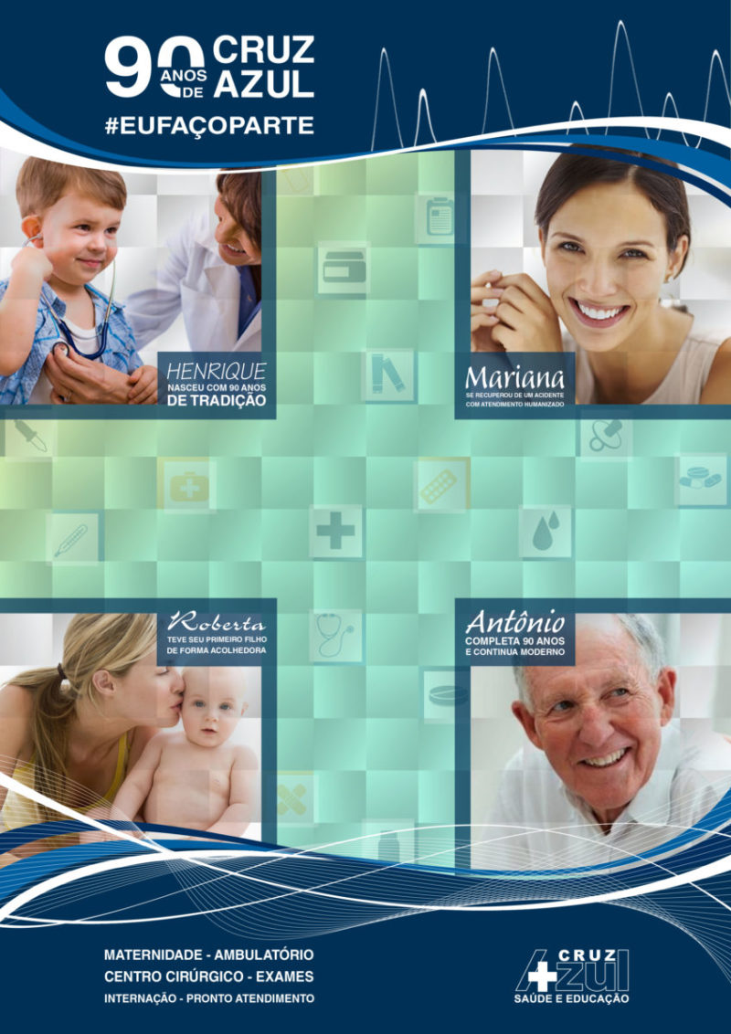
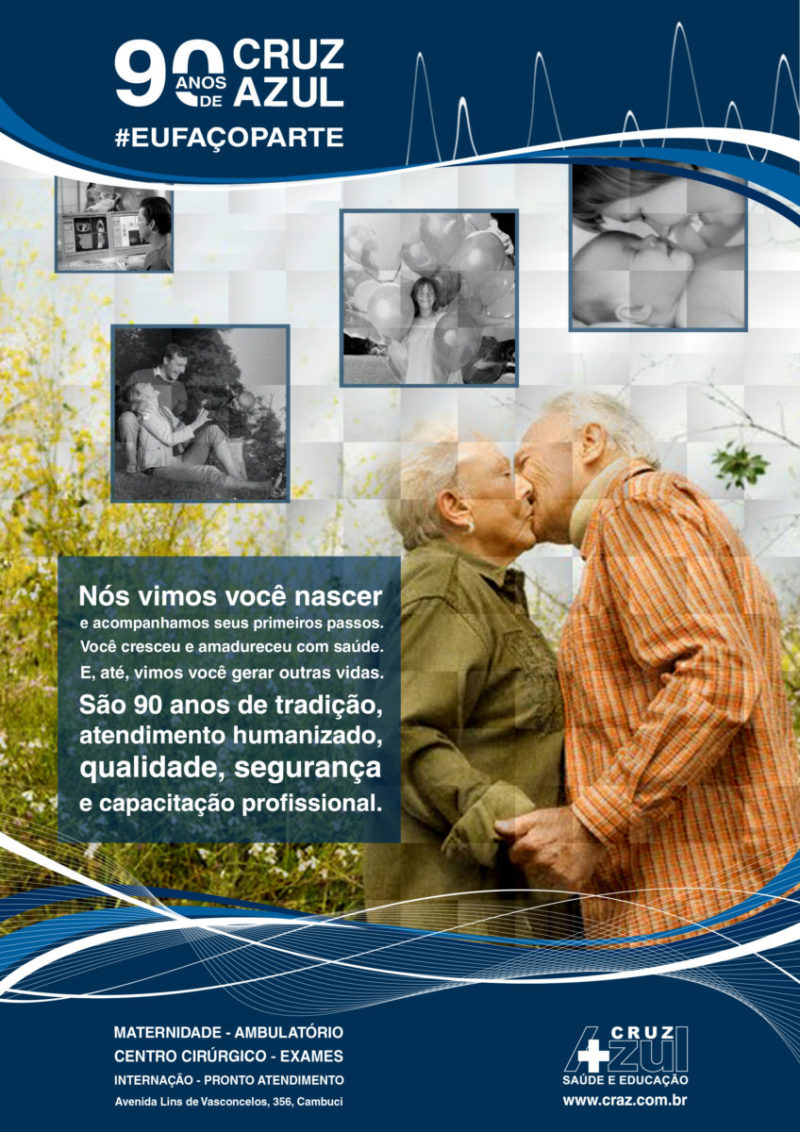
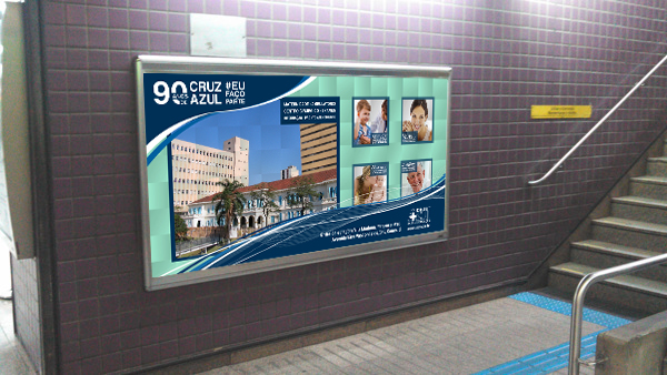
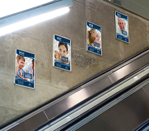
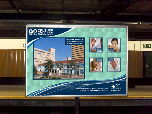
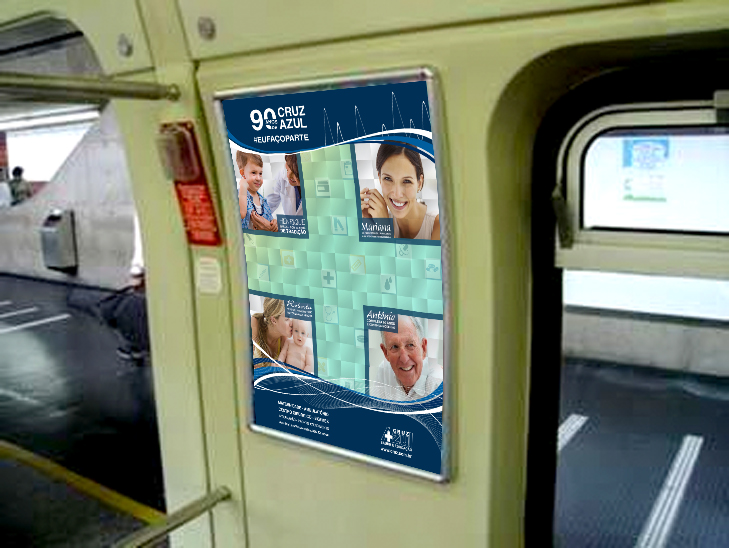
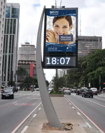
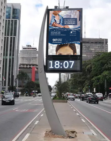
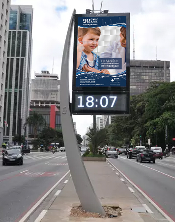
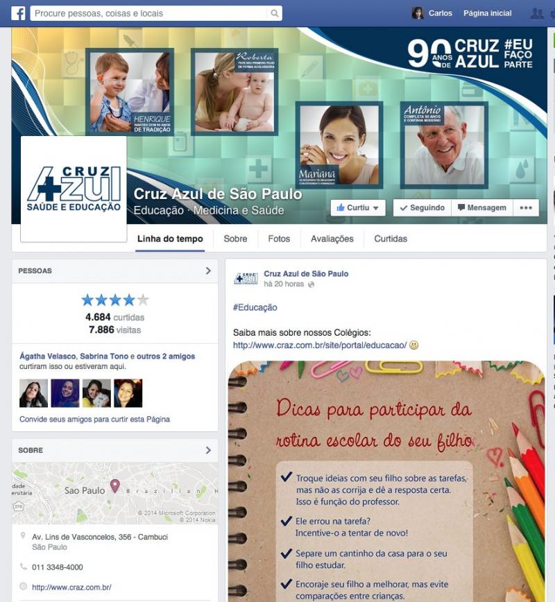
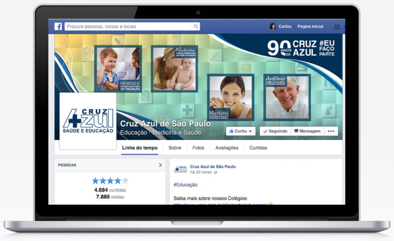
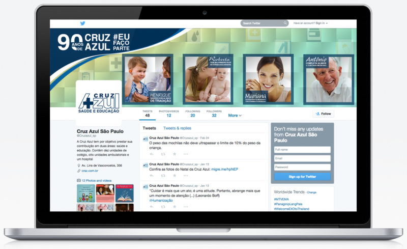
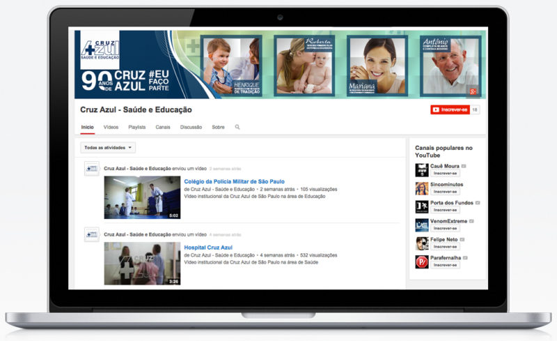
The goal of communication focused on changing the position of the brand, prioritizing its humanized service and applying a more modern identity. We use the slogan "# EUFAÇOPARTE (I am in)", with the aim of representing the patient's satisfaction in feeling that it was part of the hospital's history, being another victory won in the life of each person.
Visually, we try to keep elements of the current visual identity as the logo, the main color of the brand and some visual aspects like curves and images of people. As a central issue, we will use the grid squared in evidence, to symbolize the aggregation of the elements. In addition, to give a modern look, we use a set of curves and lines along the pieces, which refer to heart beats. For advertising texts, we use the Helvetica LT Std font, because it has an impact character, good reading and balance with the curved shapes used in the layout.
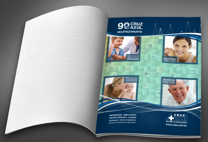
The pieces created were: Concept Art, arts for dissemination in the subway (banner, sanca, panels), newspaper ad, magazine page, street clock, tv commercial, radio spot, website, twitter, facebook, youtube and seasonal advertisings.
We also made a media plan, to choose the best vehicles and frequency to apply the communication. See more information in the creative book.
| Client: Cruz Azul | Date: December 2014 |
| Developed: Academic |
Advertisings


Commercial
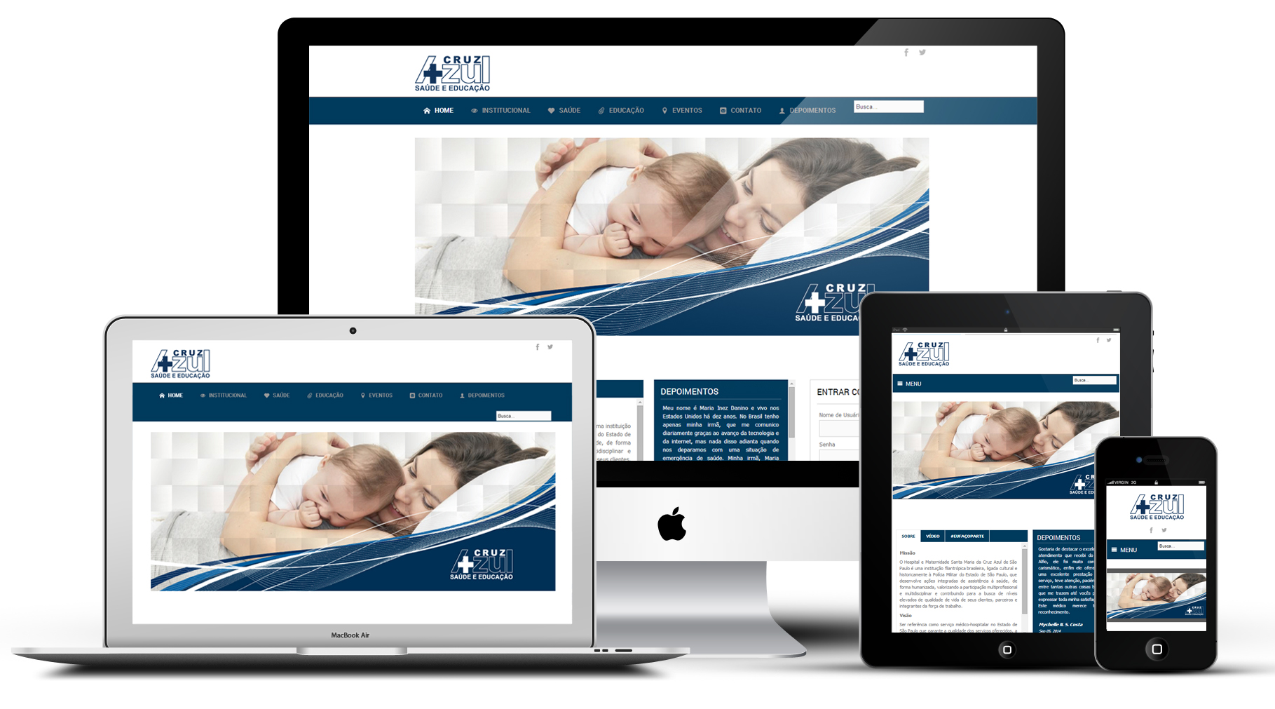
Wesite